Discorvering & Exploring data in Snowsight
The beta version of Snowsight is available as a preview app in Snowflake and is the successor to the SQL worksheet. It is an interactive SQL editor in which visualisations can also be created. Snowsight is designed to make the work of data analysts easier. The new features within Snowsight are aimed at increasing productivity, promoting collaboration and visualising data.
Interface
When you open Snowsight, you’ll see a menu containing the options “Worksheets”, “Dashboards”, “Data” and “Compute”. A worksheet is needed to write queries and the result of the query can then be visualised immediately. What immediately catches your eye when you start writing a query is the auto-complete function. Auto-complete helps writing queries and gives suggestions and information about for instance functions and syntax. In addition to the auto-complete function, filters can be applied that automatically generate the corresponding query. Snowsight offers a standard filter for filtering on daterange or datebucket. Besides the standard filters, there is also the possibility to create your own custom filters. Another function that is present within the worksheet is the “Format Query” function. This changes the query format and is displays it in a structured manner.
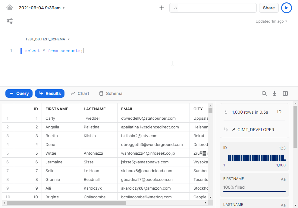
Within the worksheet you can write the query and below that you can find a number of tabs (Query, Results, Chart & Schema). In the tab “Results” raw data can be viewed. On the right side of the results, various metadata generated by Snowflake are also shown. Examples of these metadata are:
- Percentage of filled fields within columns
- Counts per category within a column
- Automatically generated charts
When a specific column is selected, the metadata for this column will then be displayed. At a glance you can see, for example, that a column contains NULL values. In addition, this metadata can also be used as a quick filter. If you select a column and then click on the percentage of “blank” values, only the rows with the “blank” values will be displayed. In this way, you can quickly explore the data without having to write a separate query.
Visualisation
In the tab “Chart”, visualisations can be made of the query results. There are a number of types of visualisations available:
- Line
- Bar
- Scatter
- Heatgrid
- Scorecard
Within the chosen visualisation there are a number of options to customise the display to your own preference. The visualisations in Snowsight are useful to quickly and easily observe patterns in the data or to get an impression of the data quality without too much effort. Furthermore, queries and worksheets can easily be shared with other users via the share button in the menu.
Besides the “Results” and “Chart” tabs, there is also the “Schema” tab. Here you can search for tables and pin them to an overview. In the overview you will then see the pinned tables with the corresponding columns. So you have all the tables in one overview and you don’t have to write a query or switch between different tables all the time.
Currently, Snowsight beta is available as a Preview app within the Snowflake platform. And the features described above can be tested there. Further information can be found on the Snowflake website, or contact cimt for a demo!